Free Resources for Entrepreneurs 1 - Web Developer's Heaven
Published on March 17, 2021

March 17, 2021Free Resources
Making sure Your website looks good on every screen is a big pain point for every entrepreneur & developer.
I cannot count how many times was I writing these multiple lines of CSS ending up with a nice design, only remembering that you forgot about the 4 other screen sizes… The proble is you cannot preview how your site looks like on few different devices at the same time. Switching back and forth in Your developer tools is a nightmare, too! If only there was a way to have all screen sizes simulteanously, side by side…
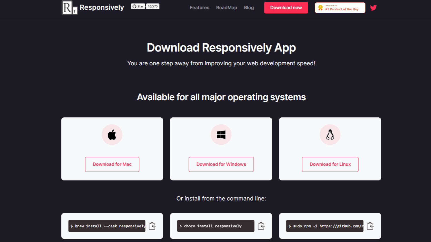
Luckily, there is. Responsively is a blessing for every web developer out there. Not only is it available for Linux distrubutions (all major ones; there is an AppImage provided), Windows & Mac OS. There is even a web extension that lets you send a webpage to Responsively.
I cannot stress how useful this tool is, and I will use it every time I am making a webpage. It’s open source, too!
Note: I am not affiliated with Responsively, nor do I earn any commission from recommending it to you.